
A Return to Simplicity
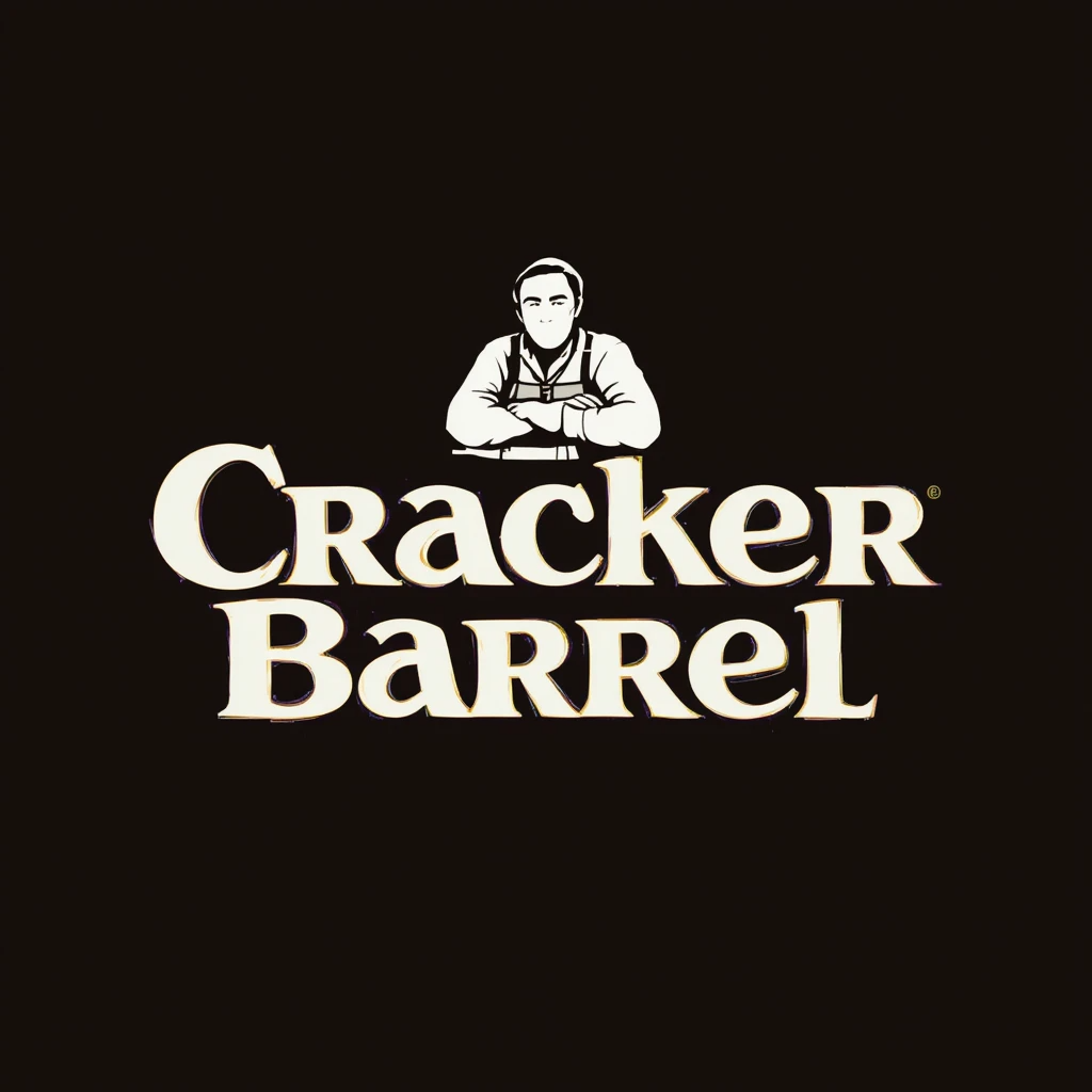
Cracker Barrel recently unveiled a major branding change: their iconic logo now shows only the restaurant’s name—no man, no barrel. This minimalist design is the first time since 1977 that the logo is solely text-based. The graphic of a man leaning against a barrel has been dropped in favour of clarity and modern appeal.
Rooted in Tradition… with a Fresh Twist
Company statements emphasize that the new logo remains rooted in its legacy. The design is anchored in the familiar gold and brown tones and the updated design reflects a refined barrel shape implied in the text outline.This pays the homage to where the brand began.
Inspiration for the refreshed colour palette comes from staples of Cracker Barrel’s menu—farm-fresh scrambled eggs and buttermilk biscuits. The logo shows that it is infused with warm, inviting shades into marketing materials.
Rebranding as Part of “All the More”
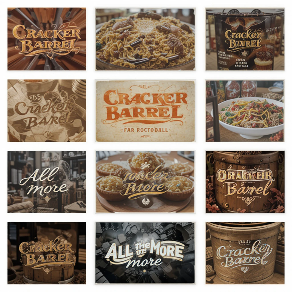
This logo redesign is a key component of Cracker Barrel’s broader “All the More” campaign to bring renewed energy to the brand, which includes updated store interiors, a refreshed menu, modern decor, and a partnership with country singer Jordan Davis.
Reactions: Nostalgia Meets Criticism
While the chain aims to modernize, the removal of a long-cherished symbol sparked backlash. Long-time patrons lament the erosion of the brand’s familiar rustic persona, with some describing it as a loss of culture or identity.
Beyond customers, the shift has become a flashpoint in the culture wars. Some conservative voices accused Cracker Barrel of abandoning “tradition,” even going as far as labelling the rebrand as “woke.” Donald Trump Jr., Benny Johnson, and others expressed strong dissatisfaction over social media. The Daily Beast
However, Cracker Barrel executives remain resolute. CMO Sarah Moore has asserted:
“Our story hasn’t changed. Our values haven’t changed.”
CEO Julie Felss Masino emphasized the need to feel relevant for today and tomorrow.
The Bigger Picture: Remodels and Modernization
Decluttering antique-style decor in favour of lighter, contemporary farmhouse aesthetics is part of the broader interior renovations that coincide with this logo change. About 40 locations have so far embraced the new style, and the campaign is spreading to all 660+ locations.
Summing Up
Cracker Barrel’s new logo marks a deliberate pivot—simplified, clean, and forward-looking—yet still mindful of its heritage. While reaffirming core values of hospitality and warmth, it’s part of a comprehensive effort to revamp the brand experience from visual identity to menu. Responses have been mixed that range from nostalgic longing to political criticism. And the chain remains committed to its vision of evolving without losing its soul.